Compass Air Cargo
Preparing a new brand for takeoff
Client
Compass Air Cargo is a start-up international cargo carrier that spotted a post pandemic opportunity to fly routes where there was great demand, but not enough flights.
Challenge
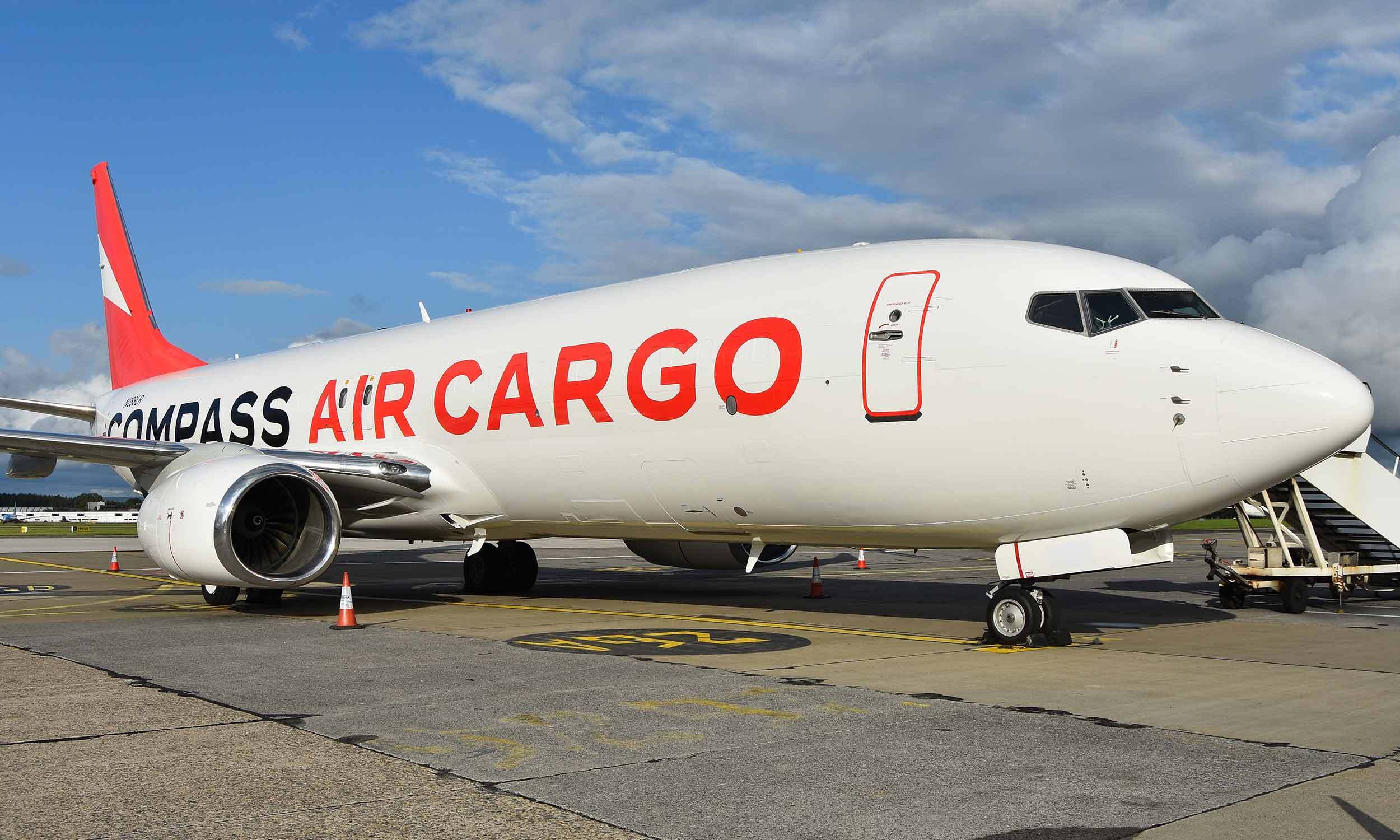
Compass approached Novagram looking for a powerful branding solution with the goal of helping to build awareness of the new carrier and also to stand out in their sector. The new brand, of course, had to work on their Boeing 737 cargo planes.


Approach
Novagram began by talking with the company founder to learn as much as possible about the air cargo marketplace and about what the company was looking for in terms of a brand. We also spent time researching the competition’s brands as well as those of passenger airlines, to make sure that our solution was unique.
We presented several options to the company founder directly, and our first-choice idea was approved during our first presentation.
We had studied the schematics of the Boeing 737 cargo plane and used its wingspan to create ‘the compass arrow’. This shape, pointing north in the full version of the logo, perfectly combines the brand name and company activity. It wraps around the plane’s tail too, leaving a pleasing aerodynamic shape on both sides. The arrow was paired with a wide, bold font that was chosen to maximise the brand name on the side of the company’s planes.
To make the Compass brand even more eye-catching, we specified a bright red that could be easily matched by the team responsible for painting the aircraft. We sent detailed, scaled plans showing exactly how the livery should be applied to the Compass fleet.
In addition to the Compass Air Cargo, Novagram created variations of the branding to represent Compass Airways, Compass Air Belgium, and Compass Technic, with the same idea working to represent multiple entities and different countries. And for compass Technic – the airline’s technical services division – we used the same shape to create a different kind of compass.

Results
Creating the branding for Compass and seeing our work rendered at such a large size on the planes has been enormously rewarding. We’re delighted that the company is so happy with the result.


